How to make a scientific poster
Introduction

Me and a mentee, Clara Kieschnick, with her poster at the Stanford Biology Undergraduate Research Program (B-SURP) end-of-summer symposium (2019).
Are you making a poster for a scientific conference or symposium? Look no further, this post will cover the basics of making a great scientific poster!
This post will focus on making posters for in-person poster sessions, but I will have a section about presenting posters online near the end.
I hope this post is helpful to you!
A caveat: I’m an ecologist, so the examples are specific to the fields of ecology and evolution. Most disciplines have generally similar poster expectations, but know that your field and lab may have slightly different preferences and norms than what I’ve described here.
Another caveat: I will be focusing on posters for scientific conferences here. Infographic posters for a general audience (folks without higher education in STEM) will not be discussed here, although they are really cool and I have taught workshops on how to make them!
How do poster sessions work?
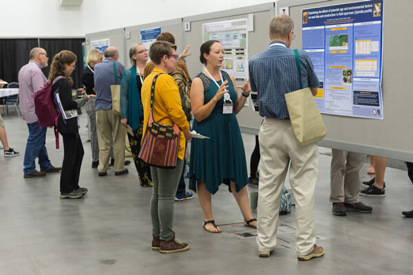
Photo source: Ecological Society of America meeting 2019 in Louisville KY, https://www.esa.org/saltlake/program/abstracts/call-for-contributed-poster-abstracts/
At an in-person poster session, there are usually many posters hanging on boards in "hallways" in a large space or conference center. The poster presenter will stand in front of the poster and people attending the session will be walking around. Some people will glance at your poster and keep walking, and some will stop and talk to you.
Here is an example picture of people presenting at a poster session at the 2019 Ecological Society of America (ESA) meeting:
Generally, people who stop will expect you to give a 3-5 minute quick summary of your poster. Sometimes, people will stop you while you are talking to ask questions, or wait until you are done speaking to ask questions. Sometimes, multiple people will be listening to you at once. Poster sessions usually last 1-2 hours, and you are generally expected to be standing at your poster during that entire time. Usually, there are multiple sessions, so you'll be expected to be standing at your poster for 1-2 hours, and then there will be allocated "time off" for you to walk around and see other posters. Posters are usually hung for the entire day or conference, so you can walk around during "off times" (when an official poster "session" isn't happening) and no one is around just to take a look at what posters interest you.
There have been a variety of online poster sessions happening recently. The formats vary widely, but generally the poster presenter records a 3-5 minute video of them presenting their poster and there is so format for some discussion/questions about that poster.
Before getting started
Before you get started, there are a couple of key points that you should keep in mind:
Where are you presenting?
What is the venue for this poster? Will it be in a big conference hall with hundreds of other posters? Will it be during a small poster session with only 10-30 other posters? Will you be presenting the poster online? How large can your poster be? Can you bring other props or hand-outs to help you explain the concepts on your posters? Tailoring your poster to the unique context you will be presenting will help you shine!
Who will you be talking to?
Think about the norms and expectations of your audience. If you are presenting to ecologists, the language and illustrations on your poster can be different/more specific than if your audience is biologists generally, or if you audience is non-scientists. Different groups may have expectations for what your poster should have on it, or the different sections of your poster, than others. In this post, I will assume that you are making a poster geared towards biologists generally (not necessarily just ecologists), but not for a general audience of non-scientists.
What is the main take-away message that I want people who see my poster to walk away with?
Because a poster is just 1 giant sheet of paper (or screen), a viewer will have an overall visual impression of your work. A poster is unique because you want a viewer to have a summarized perspective of the work by looking at the poster as a whole (if they are walking by, perusing posters), but have sufficient detail for you to explain all of your key supporting evidence to your overarching story if they decide to stop by and talk to you about it.
As you can see here, at a poster session, there will be people who stop and listen to your poster, and people who will just walk briefly by and look without stopping.

Photo source: Ecological Society of America meeting 2019 in Louisville KY, https://www.esa.org/saltlake/program/proposals/consider-a-poster/
Where do I start?
Before you get started, there are some logistical things you'll need to figure out:
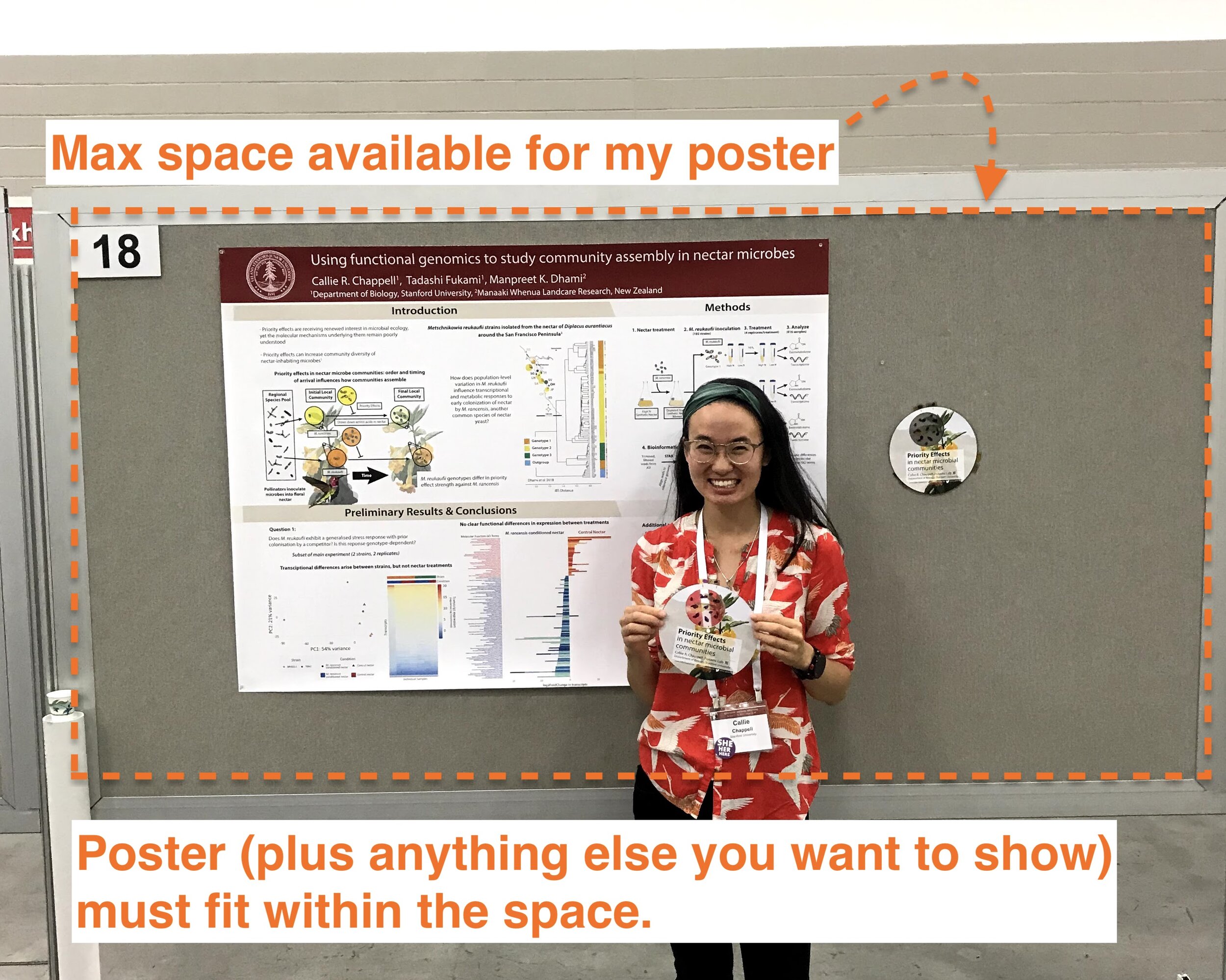
How large can your poster be?
For a paper poster, the conference will have specific specifications about how much space you have for your poster based on how large the poster stands are. You'll need to design your poster to meet these specifications. Usually, the conference website will have this information. Sometimes, conferences will have non-standard poster boards, so it's really important you check this before making your poster. Re-sizing posters is a TOTAL pain.
This is a picture of me and my poster at the 2019 ESA conference:
Other things to consider when deciding the size of your poster:
Will the poster be displayed in your lab afterwards? How much space do you have available there?
Will you want to re-use the poster at future conferences? If so, what size requirements do those conferences have?
Will you need to travel with the poster? If so, will it fit inside of a standard poster tube or case?
If you are presenting your poster virtually, will it fit easily on a standard screen? What about on a Phone or iPad? Even you are designing the poster for digital viewing right, would you want to print it out in the future?
A side note about poster carriers:
Examples of poster carriers:

Usually, the place that prints the poster will give you a plastic cover or wrap your poster in a big sheet of thin paper with rubber bands. You can also buy a cardboard poster tube (pretty cheap, ~$10) or a plastic poster carrier (more expensive). Your lab may have some extra poster tubes that you can borrow if you ask ahead of time.
2. How will I print the poster?
Before starting your poster, decide where you will print the poster. Some places require substantial lead times to get the poster. For example, a FedEx may take 1-2 days to print your poster, or a campus spot may take 2-4 hours to print. These posters are large and can be expensive to print. You can ask whether your lab can print your poster for you (for free). You may also get free printing through your program, department, or other campus affiliations. If you have to print your own poster, Costco is a very cheap place to print posters, but they cannot print very large posters.
Different printing places will have different poster dimensions that they can print and will offer different paper types. I'd recommend calling the place that you want to print your poster at before designing the poster and check these things.
This is what I would ask about:
What is the largest poster dimensions you can print?
How are posters priced? (Sometimes there is a base price for a standard size, but then they charge a lot for any larger than that)
Is your printer CMYK or RGB?
How early do I need to submit my poster to get it printed by X date/time?
A small side note about color encoding:
There are 2 different color encoding types for printers, and you need to design your poster with the correct color encoding to make sure that your colors aren't printed a little off. Usually this doesn't matter much, but the difference between CMYK and RGB is very noticeable for black sections of your poster and may throw off how colors in figures and plots look printed out compared to on your computer)
I designed this cool-looking poster in 2018, but it looked terrible printed out because the color encoding was off with the black background:

A small side note on cloth posters
Some people are promoting making cloth posters instead of paper posters. Cloth posters are nice because they travel well (if you can iron them) because they can fold into a suitcase instead of having to carry a bulky poster tube. They are arguably more environmentally-friendly and can be recycled into a VERY cool blanket or other clothing after the conference.
Here is a company that prints cloth posters that was suggested by a colleague, Anay Reddy: https://www.biotech-productions.com/products/foldable-fabric-poster
Here is an example of a cloth poster:

Here is a creative example of an up-cycled poster turned into a COOL MASK!

3. When do I need to have the poster completed by?
Posters always take a long time to complete and there are OFTEN issues with printing, so I would make sure that you have your poster printed and ready to go at least 1-2 full days BEFORE you need it or you leave for your conference. Also, always bring a digital copy of your poster with you in case your poster gets ripped, lost, or stolen while you are away.
How to design a poster:
1. Think through your story:
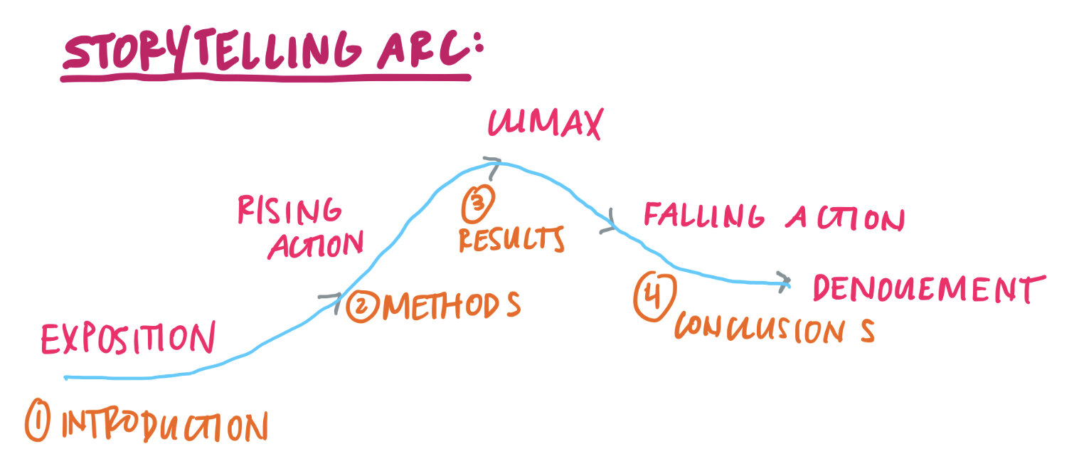
When you give your poster spiel, you'll be telling a story with a rising action (introduction), a conflict (your research question), a climax (your experiment and results), and a resolution (conclusion). But unlike a talk, all of that needs to be conveyed in one "eye span". And on top of that, you need to be able to cover various stages of inspection: you need a poster that makes sense immediately to someone casually glancing at it when they walk by, or someone who wants to stand with you for 30 minutes, look at everything, and ask you questions.
To craft the best visual "story", you want to make sure that your story is clear before designing anything.
I like to write out my dream "spiel script" with the storytelling arc, and then ask how I can translate that into how I communicate that story visually.
2. Brainstorm your graphics and plots
Once you have a script in mind, you can start thinking through how you can depict the ideas in your script visually. You can sketch out how you'll depict your ideas from your script using pictures and graphics instead of text. You want to minimize text on your poster. Anything idea you have should be shown using pictures and data and only use text for headers and only when absolutely necessary elsewhere. This is different from most of the posters you'd probably seen and believe me, those posters are not as good as posters with more graphics.
Here is an example of some graphics sketches and how they relate to your layout:

If you've already given a talk on this research, or written a project proposal, you may already have some figures and graphics that you can adapt for your poster. Others in your research lab may also have graphics they've made that you can modify and use -- just make sure that you reference any graphics or artwork that you did not make yourself!
There are a few sources for great graphics:
You can also use photos and make the background around the focal image white, so that the real photographs can be icons on your poster.
I made a video a few years ago about how to make graphics using Adobe Illustrator:
I also made graphics using my iPad, as described in this video:
Important note: In this video, I reference using Adobe Draw. Adobe Draw has been replaced by a newer app, Adobe Fresco.
You also want to have some idea of how you'll show your plots as well. Here is a quick visual guide of best practices when making plots for posters:

Here is a video I made about editing plots in Illustrator from R:
2. Sketch out your poster layout:
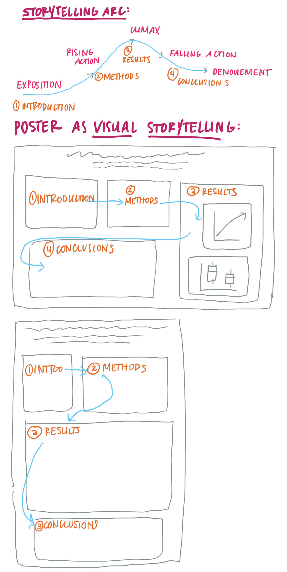
Next, now that you have some idea of the components you'll be using, you want to outline your poster design so the reader's eyes follow your storyline (made up of graphics and plots and sparingly, text) in a logical order. You also want to make sure that the visual emphasis (like the most central, eye-catching location) features your "climax" point and everything else either builds up to, or comes down from that.
Here is an example of how you could outline posters to follow your narrative arc. The blue lines follow your storytelling spiel and the order of where you want your viewer's eyes to follow:
Here is an example of a poorly-designed poster, from the perspective of having clear eye-flow:
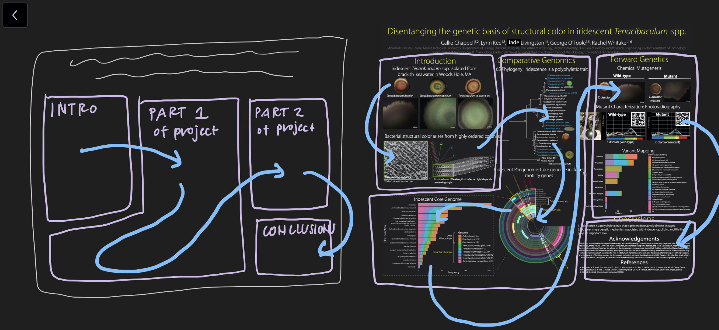
The light blue lines represent the direction your eyes would flow as I explained the information on the poster. You can see that the information is not organized in a clear way as we progress through the poster:
This is shown by comparing the eye-flow pattern from the sketch to the final poster. Also, when you look at the poster, it's not immediately clear what the main point and main focus of the poster should be. What is the climax? Not immediately clear without having someone stand by the poster and explain it to you.
Here is an example of a better designed posted, from the perspective of having clear eye-flow:
Again, the light blue lines represent the direction your eyes would flow as I explained the information on the poster. As you can see the information flows from left to right, as one would read, and is visually organized in colored boxes with clear headers. I even designed the headers to be "arrows" that direct the readers' eyes to go in the direction of what to read next.

Often, posters will use the same general structure, which you will see when you read general help guides on making a scientific poster:

Here is an example of a poster that I made as an undergraduate that is close to this:

While this is a great format for most posters and is very clear and predictable, it doesn't always work depending on the amount of information you have for each section and how you want to depict it visually. Maybe you have a large methods graphic and less results/plots, so you need them to take up different amounts of space.
This is why I suggest you think carefully about what you have and what you need, and then design a poster with good flow given that.
4. Choose a software to design a poster in
Now, you are ready to get started designing your poster.
Most people design their poster using Microsoft PowerPoint or Google Slides.
Here is a video about designing posters in Microsoft PowerPoint: https://www.youtube.com/watch?v=_WnhoIbfcoM
Here is a video about designing posters in Google Slides: https://www.youtube.com/watch?v=Tib4xnH2jwQ Definitely don't endorse the design choices of either of these posters, but they are good overviews of how to design posters in these programs.
I personally design my posters in Adobe Illustrator (which is why most of my tutorials are using Illustrator), but I wouldn't recommend that for people who are just getting started and don't already know how to use Illustrator and have it on their computer. If you absolutely want to use Illustrator, most university computers have it. You can use a computer in-person, or use a remote desktop to access a university computer from your laptop remotely.
Here is a video I made about setting up posters in Adobe Illustrator:
Now you are ready to start designing your poster!
Principles of graphic design:
When designing your poster, you want to make something that conveys your ideas well, while also being visually pleasing.
Here are a few suggestions for designing an effective poster:
Color:
Develop a cohesive color scheme for your poster that is cohesive between your graphics, plots, and text/headers. There are a variety of nice color scheme generators that can create nice color schemes for you: https://coolors.co/. Make sure that your color scheme (especially if used to differentiate points on a plot) is color-blind friendly. There are a lot of sites online that can help you check this.
You can designate one color to be your "accent" color that highlights some visual elements in your poster. For example, if your project focuses on microbes (that live in flowers), make the microbe color stand out more than for the plants and other visual elements. This is also true for emphasizing key phrases or words that you want to stand out.
These are infographics meant for a general audience and NOT scientific posters.
Here's a nice example of where color (in this case, the yellow accent text) was used to draw attention to the main point of each square: (note that this is an infographic meant for a general audience and NOT a scientific poster)

Image source: https://www.zazzle.com/store/fossilera/products
In contrast, this is an example where colors are more confusing. In the right column, the "boring" verb is highlighted in green, but in the left column, the "boring" verb is highlighted in red. Green is usually (when contrasted against red) seen as "good" whereas red is "bad". Having two different colors that show visual difference, but having those color differences be meaningless in the context of the graphic is confusing.

2. Scale:
How large should some elements be relative to other? You don't want to have huge header text and tiny figures. On the other hand, you want to use headers to visually structure your poster, so they can't be too small. You can play with scale/size of text to make sure that it presents a cohesive story.
Another important thing is making sure that your text is large enough. It should be large enough to be easily read 5-6 feet away. You can make your design 100% on your computer and step 6-7 feet away to see whether it's large enough.
Besides having too much text, in this example, the paragraph text is way too small to read. Plus, the key points of the poster would not be apparent without reading the entire poster or having someone explain.

In this example, the header sizes are way too small, so there is very little visual difference between the headers and the main text. Frankly, there shouldn't be any "main text" (beside a few bullet points) in the first place.

3. Fonts:
What font should you use? A few guidelines on this:
Use the same font throughout the poster. This is especially important between plots and your main text. This is how to change fonts in R: https://rpubs.com/gbonafe/ggplot2-font
It doesn't matter whether you use serif or san serif fonts. Seriously. But don't design an ultra-modern poster and use a serif font. The font you choose should be consistent with your style. Except never use Times New Roman. Or Comic Sans. Please.
Don't use fancy fonts. If you accidentally rip your poster and then need to print it on the fly (or open it on someone elses' computer) and for some reason they don't have the right font, you're in trouble. Stick with the classics. Except Times New Roman or Comic Sans.
Like I said above, make sure that your font sizes are large enough to see far away (5-6 feet)
Except for a few choice words to highlight, make sure that all of your text is black or a VERY dark color. But then again, you shouldn't be using much text anyway.
4. Simplicity rules:
Let me be clear: I love to make things look beautiful, but scientists like their posters like they like their writing: as simple as possible. Here are a few things that I forgo for my scientific posters:
Things to forgo:
Ditch the fancy, beautiful fonts
Ditch poster backgrounds
Ditch any graphics that are not strictly necessary for explaining key elements of your story
Why kill all of these darlings? Because at the end of the day, your poster is a visual story. And just like superfluous adjectives and flowery language gets in the way of clearly communicating a story, this visual "fluff" will get in the way of making a strong, clear impact on your audience.
Things to include:
More white space than you think you need. No one will want to come to a poster that they are overwhelmed to look at.
Clear visual delineations of the sections (headers and/or colored boxes do this way)
Mature use of color. You know what I mean.
Examples of excellent posters:
These are examples of award-winning posters. Of course, aesthetics are not the most important criteria in judging these posters -- much of the merit is from the research and the presenter's ability to engage the audience -- but they all have some good characteristics I want to highlight.
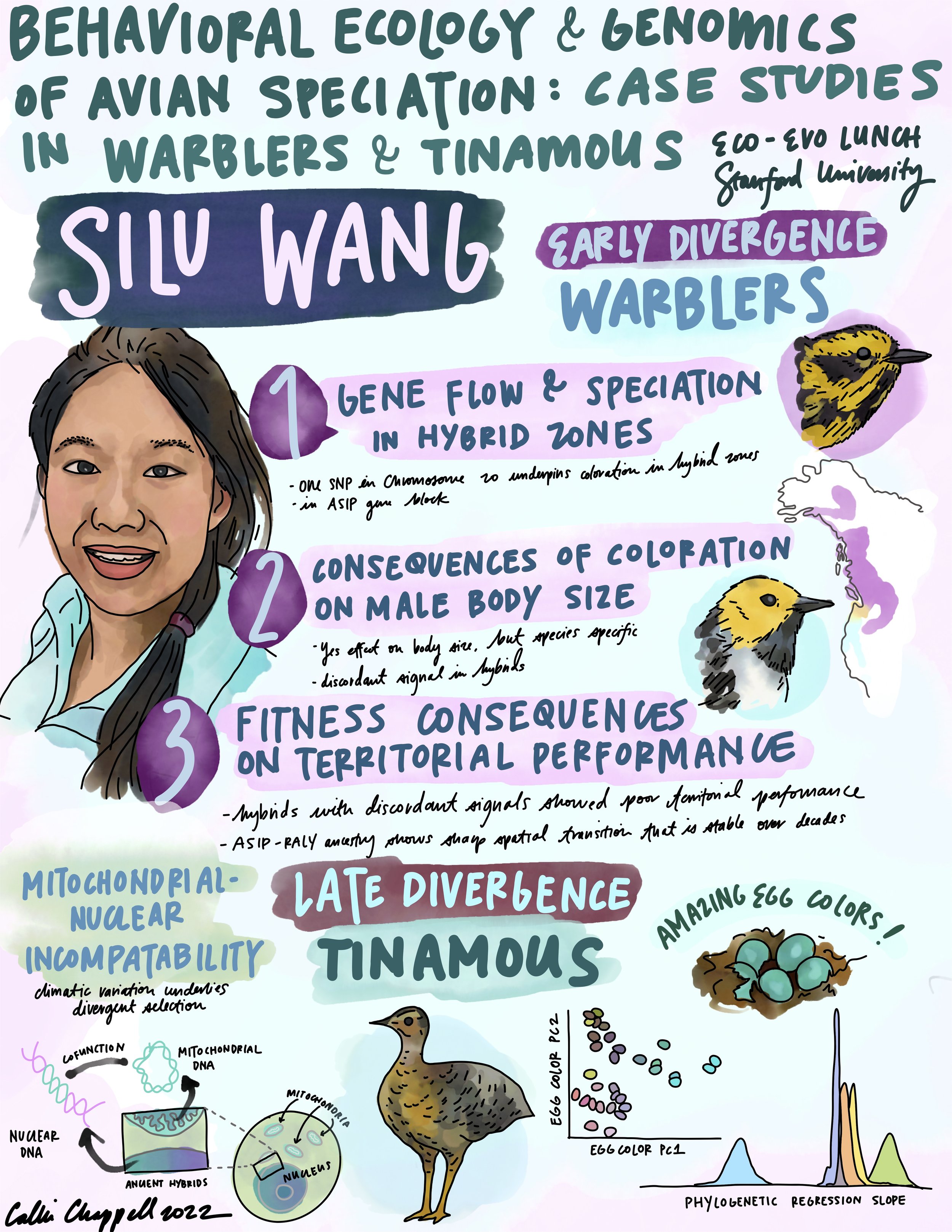
2019 Evolution award-winning poster (@silurian_wang):
This is one of my favorite posters of all time. It doesn't haven't the standard "introduction", "methods", "results", and "conclusions" section labels, but jumps right into the key questions and how they were answered. The colors are consistent and the entire poster is dedicated to communicating the story of the results as clearly as possible. Great job, Silu (王思露)!

I recently made this live sketch of a talk Silu gave about this research inspired by her amazing poster!
2017 Ecological Society of America: Braun Award Winner (@crowl_ta) :
This poster had some nice graphics illustrating key concepts and a nice balance of figures. Too much text, in my opinion though!
2015 ICCB (International Congress for Conservation Biology) award-winning poster (@TimDoherty_):
This poster has a nice balance between graphics and text. Interestingly, it doesn't have the standard "introduction", "methods", "results", and "conclusions" section labels! However, it is very clear which direction the reader/viewer should progress.

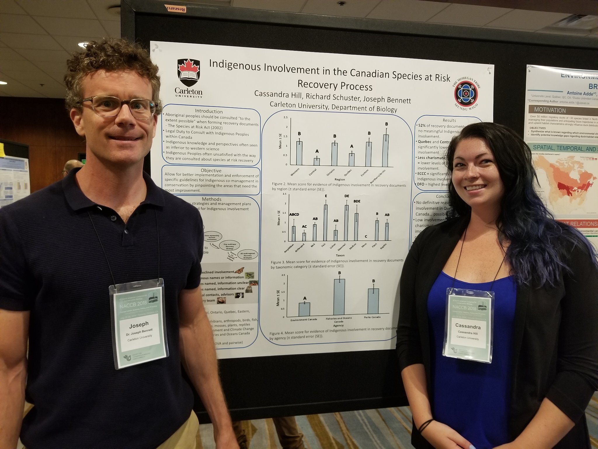
2018 NACCB (North American Congress for Conservational Biology) award-winning poster (@CassieHilll7):
This poster does a great job centering the results as the main focus on the poster. The plots are extremely clear and easy to read, although there is a lot of text.
2016 Irish Ecological Association Conference award-winning poster (@MariaGaragouni):
I think this poster does a good job integrating photographs of their study sites, maps, graphics, and clear plots of the results.

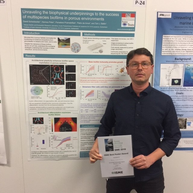
2019 ISME (International Society for Microbial Ecology) award-winning poster (@sber-epfl):
I really like this poster. There are nice graphics associated with each section, with especially great figures that are very clear and easy-to-read. There is a very logical flow to the poster.
And one last one… (@NicholasWuNZ)
Although this poster wasn’t award-winning (as far as I know), I want to highlight it before of the exemplary style and plots. The text in the plots is a bit hard to read and the scaling isn’t the best, but it’s gorgeous!
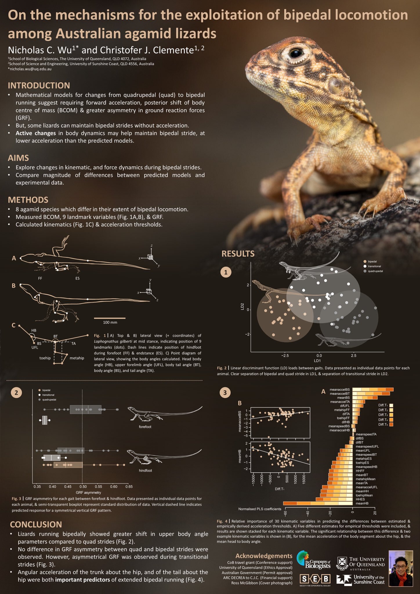
Image source: https://twitter.com/NicholasWuNZ/status/1139297595128369152?s=20
Poster add-ons:
After looking at all of these posters, you can see that there are a few different approaches to making posters.
Stand-alone posters: these posters have enough text for someone to walk past and, after reading the text on the poster, you can understanding everything.
Presentation posters: these posters require you (or someone) to be standing with the poster and explain what is happening in order to understand what is going on. Personally, I am in the presentation poster camp. I see the poster as a visual aid that helps the communicator explain their work.
In this line, I have suggestions for a few additional components that are "poster plus" that may also help you explain and make your poster stand out in a poster session of potentially hundreds of others.
QR codes:
Want an easy way to cite a paper, or link to another resource? Consider embedding QR codes into the poster. Your QR codes can also link to videos, VR experiences (associated with your poster) and a lot of other cool stuff. The possibilities are endless!
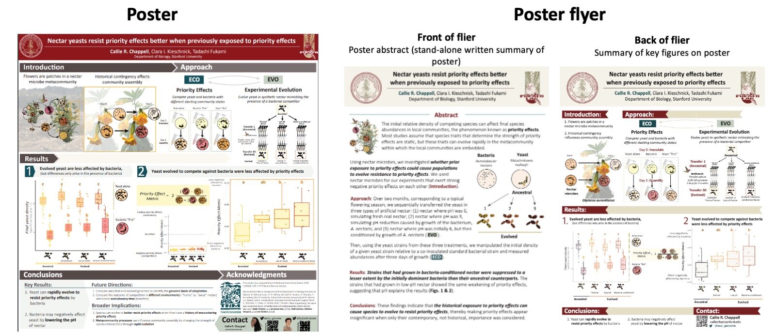
Poster flier:
I like to make a smaller, printer page-sized flier with more text to explain my poster for those who can't see me explain it. I put the fliers in a folder, which I push-pin to the bottom of my poster board. I also like to hand them out to people who stick around to chat about my poster and seem genuinely interested.
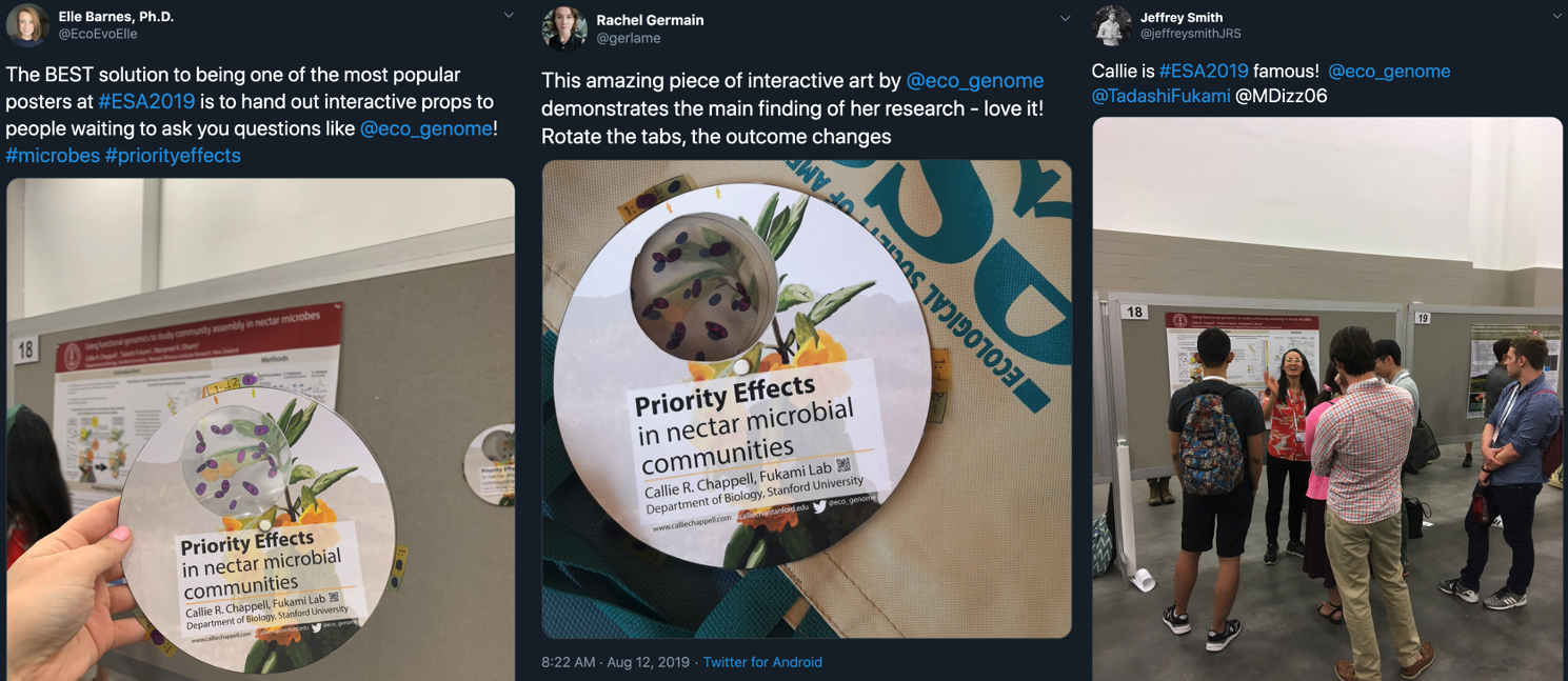
3. Props:

Believe it or not, props can be a great addition to your poster. I made these "wheels" that explained the priority effect concept on my poster, which I struggled to explain using a 2D picture on the poster. I brought these wheels and handed them out to people at my poster when I needed to explain that concept.
This was also a great advertising opportunity, because those who saw them (or received them) did a lot of promotion on social media and showed their friends --who later came by my poster. This made my poster at ESA really popular, and once you have a crowd at your poster, more people come by to see what the commotion is all about.
People really don't like waiting, though. So I handed the people waiting to talk to me/hear my spiel a wheel to play around with and look at, which helped keep them engaged and at most poster listening for longer.
4. Data sculptures:
There is a professor at Stanford in the Department of Microbiology and Immunology, David Schneider, who makes these incredible data sculptures out of wood and other materials that are meant to be small or disassembled for traveling and then reassembled at a conference for a poster session.
These actually depict data and are a different way of showing data (instead of 2D pictures). Very cool!
Similarly, there is a group (@TempestryProj) that knits global temperature data to visualize climate change:

More examples of SciArt I want to highlight:
There are a few other artists whose work I follow on Twitter that I would like to highlight here specifically. I believe that integrating science and art is the best way to communicate our work to other scientists and the public.
René Campbell
René is an incredible painter and scientific illustrator, in addition to being a PhD candidate at Flinders University.
She has an incredible poster that only highlights a small portion of her amazing work:


Amy Cheu
Amy Cheu is also an incredible artist that I aspire to emulate. Amy is a PhD candidate at Clark University and in addition to studying lizard locomotion, is also an incredible scientific illustrator.


Virtual Poster Sessions:
With the move online due to COVID-19, more conferences and research programs are moving poster sessions online. In many of these poster sessions, presenters are asked to record a 5-minute video. One straightforward way to do this would be to use screen recording software (such as QuickTime on a Mac, tutorial here) of yourself sharing your screen with your poster and zooming in on different sections. However, a potentially easier way to do this (if you don't actually have to make a poster) is to prepare a shortened slide deck and then just record yourself talking through the slide deck as you would a talk.
One cool aspect of a virtual poster session is that you can include videos into your presentation. For example, you could include an animation of the data, or a video of your field site or study organism. You also could include music or other video editing. The possibilities are endless!